
THEM: COVENANT
TITLE SEQUENCE
+ Concept Development
+ Designer
THEM is an anthology series that explores terror in the United States, created by Little Marvin and executive produced by Lena Waithe for Amazon Prime Video. Set in 1953, the first season, “Covenant,” centers around a black family who move from North Carolina to an all-white Los Angeles neighborhood. Their idyllic home becomes ground zero where malevolent forces, otherworldly and next door, threaten to taunt, ravage and destroy them.
I worked in tandem with Trollbäck+Company to develop and design the visual system for the show’s package that would ultimately be recreated practically, using in-camera effects and shot at FX WRX Studio. Taking inspiration from iconic Saul Bass titles and infusing the suspense of early horror movie graphics, we aimed to create an unsettling world to document the story of the Emery family’s story of moving west and living through the horrors of redlining, segregation, and racism in the United States.
The final title sequence was shot largely in-camera using practical effects, stop motion techniques, paper + shadow play, and film degradation which was then finished with 2D animation methods to create the final mood for the piece.
Check out the BTS video for the titles here.


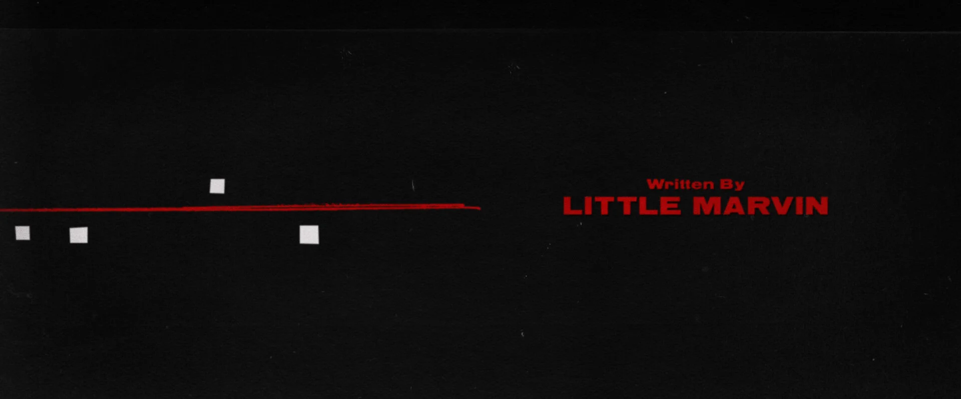
The original design and concept boards for the sequence are above. A mix of real property maps, family photos, and an abstract representation of real estate plots were tied together with an ever-growing red line creeping through all 3 “worlds.”
Below are examples of the type system that was developed for in-show location and day count cards, as well as for end credits and additional title cards used throughout the series.


